
Thursday, October 16, 2008
New blog!
In case you're wondering where I went, you can find me here. Maintaining multiple blogs was getting ridiculous.
Thursday, July 10, 2008
I bet you thought I forgot about this.
I've been blogging rather sporadically since spring semester ended. Mostly because I've been working on my other creative endeavors and completely immersed in the creativity challenge. HA! I bet you thought I forgot. Witness the Etsy link to the right and the new blog banner above. Disclaimer: I'm still working on my banner and need to take better product pictures. I never said I couldn't profit from the creativity challenge. Heck, I if I profit, it's all the better, no?
Since I'm almost finished with Hypermedia, which was a refreshing change from W&I drill camp, I'll have even more time to get my creative sh*t together. Because I'm nuts, I'm also thinking about taking an online digital photography class. I think it would be fun and clearly I need some assistance (see: disclaimer) in that department. I will say, my camera is crap and I'm planning to buy a new one so that could be part of the problem. I have to hold down the stupid "take picture" button forever before the thing actually goes off. Yes, the batteries are fine. It does this with new, old and everything in between batteries. The poor thing served me well, but it's on its last legs and it's time for an upgrade. Two upgrades, actually- this one and this one.
I'm going to California for vacation the first week of August and it would be really nice to have a decent camera to take pictures of the scenery. Although, with the situation out there, the scenery will be all burned brush and fiery hillsides. Hopefully, they'll get that under control soon. California's too awesome to go up in flames.
Thursday, June 19, 2008
Wuzzup with Harrisburg?
I feel as though I need to explain Harrisburg to those people who may have been ever-so-slightly mislead by my rants about suburbia. Harrisburg is actually a city, a small city, but still a city (about the size of Portland, ME- which is a very cool city, by the way). Harrisburg proper is located on the banks of the Susquehanna River. On the opposite side of the river there are an assortment of towns that all run together (Mechanicsburg, Camp Hill, New Cumberland, Lemoyne and Wormleysburg). This area is collectively referred to as the West Shore and it makes up part of the greater Harrisburg area.
For all my ranting, you would think this place is a total suburban nightmare, but it's really not. But since I'm more of a coast or big city person, small cities make me feel like I'm in suburbia. Although, if I was in actual suburbia, I'd probably be much crazier than I am now.
For all my ranting, you would think this place is a total suburban nightmare, but it's really not. But since I'm more of a coast or big city person, small cities make me feel like I'm in suburbia. Although, if I was in actual suburbia, I'd probably be much crazier than I am now.
So, for all those who I may have mislead slightly, here's some Harrisburg info- Harrisburg Hello


Friday, June 6, 2008
Summer, coding, and craftiness
I'm taking Hypermedia this semester and I'm not sure what to do with myself since I'm not drowning in projects and homework. Not that I'm complaining. This is a welcome change from the insanity of Words & Images. But really, code is boring. I understand why I need to know it, but actually going through the process of learning it kind of makes my eyeballs roll back in my head. At least the instructor is amusing and makes an effort to make it interesting.
So, since I have all this free time, despite taking a 3-credit summer class, I'm making some major efforts to get my etsy sites up and running.
~(Tangent: I'm obsessed with etsy. It's a problem. I waste large amounts of time perusing that site. It's fabulous and it never gets old because there is a constant stream of new, fun things to buy. I justify the large quantities of cash spent on etsy by reminding myself that I'm supporting fellow artists, artisans and crafters. Kind of a "you buy mine, I'll buy yours" thing.)~
So, anyway, back to my etsy sites. I have two- one for paintings and digital art and another for jewelry designs. Right now, it's looking like the jewelry design one will have items first. I took inventory of my supplies last weekend, made a list of what I need and made a few pair of earrings. Sometime in the next week or so, I'll order the missing supplies and make a bunch more earrings and a few necklaces. Time to start making some money.
Another summer endeavor of mine is to get my other (personal) blog back up and running because, let's face it, there are some things you just don't want to put on a blog that professional colleagues are reading.
Lastly, because I constantly have to be learning something new and stretching myself as a crafter and as an artist, I'm going to learn to make soap. Luscious, smell-good soap. This will probably warrant pictures as it will most likely be somewhat akin to a 2-year-old attempting to paint.
Wednesday, May 28, 2008
Downtime in review (otherwise titled, Back to the grind)
My (way too short) break between semesters is over today. I did manage to do a lot of the things on my list, although I didn't get to a few important ones (see, painting/drawing on the deck and watching DVRed LOST episodes). Whether or not I slept sufficiently is also up for debate. Why must dogs pee at 2:30 in the morning?
I did, however, catch up with a few friends (combined that one with cleaning out the closet). And I went to Ocean City, NJ for part of Memorial Day weekend (I'm now convinced I need to move there and open a surf shop/art/design studio and streak my hair with purple dye. If you think I'm kidding, think again). We also bought some decent deck furniture but since it rained for most of the week, the new furniture didn't get used much. Rumor has it there's better weather on the horizon. Of course, most of these activities involved wine. Lots of wine. And a few martinis. Mojito martinis. Consumed while enjoying this view:

I did, however, catch up with a few friends (combined that one with cleaning out the closet). And I went to Ocean City, NJ for part of Memorial Day weekend (I'm now convinced I need to move there and open a surf shop/art/design studio and streak my hair with purple dye. If you think I'm kidding, think again). We also bought some decent deck furniture but since it rained for most of the week, the new furniture didn't get used much. Rumor has it there's better weather on the horizon. Of course, most of these activities involved wine. Lots of wine. And a few martinis. Mojito martinis. Consumed while enjoying this view:

Thursday, May 22, 2008
Downtime
So the weather this week has been abysmal and has completely foiled my plans for moving out onto my deck for the week. We even bought new deck furniture, but it's sitting forlornly in the corner, getting soaked by this incessant rain. Maybe when I get back from the beach on Sunday I'll be able to do some jewelry design, painting, drawing or something otherwise crafty/artistic on my deck.
**********************
I haven't gotten my final grade for the semester, but since every grade I got so far was A, I believe it's safe to assume the final grade will follow suit. Allison and Stephanie had two pieces of advice, 1) Write for someone other than engineers (no kidding) and 2) Read more stuff/put more stuff in and especially stuff other than magazines like Lucky, InStyle, et al. GREAT! I wish I had recorded them saying that because the bf is not happy about my continually growing piles of magazines. Tough crap. I don't like his Bart Simpson (EAT MY SHORTS) poster hanging right inside our front door. He can deal with my magazines.
So, in an attempt to follow Stephanie and Allison's advice, I plan to subscribe to the following magazines: Ready Made, Plenty, Wired, CRAFT and Real Simple (I already read this one every month anyway, so I might as well subscribe). And, because I need to get back in touch with writing (real writing, not copywriting), I will also subscribe to either The New Yorker or The Atlantic.
As for the first part of their advice, I need to start pursuing more freelance writing opportunities. I also love creative writing (fiction, literary non-fiction, poetry, etc) and I have a ton of ideas for essays and a novel in progress. I was also a published poet in high school, but I've let too many cobwebs grow over that part of my creative self. What better time than now to dust them off and start again?
Friday, May 16, 2008
Ah, summer.
As much as I liked this class, I'm glad the semester is almost behind me. I learned a lot and have a few new portfolio pieces. However, I'm looking forward to relaxing. At least for the week and a half between the end of Words & Images and the beginning of Hypermedia.
Stuff I'll be doing between doing lots nothing:
Stuff I'll be doing between doing lots nothing:
- Sleeping
- Cracking open a bottle of good wine and reading the stack of magazines I've neglected for months
- Painting and drawing outside on the deck
- Going somewhere for Memorial Day weekend
- Cleaning out my closet - it's time to make room for new stuff!
- Shopping for deck furniture
- Catching up with friends
- Watching the entire DVRed season of LOST
Thursday, May 15, 2008
That's it! I'm done. ~updated~

Here's my final layout and an image of the front cover. Honestly, if I had a ton more time, I'd make more changes, but the thing is already assembled. I just have to pick up some ribbon tomorrow to bind it. And I really wish I could have printed this professionally. My high quality paper isn't two-sided (and it's too thick to double up), so I had to print everything but the cover on regular printer paper. I'm seriously considering bringing in a non-assembled version printed on my nice paper.
Anyway, here it is. You have to read the pages in a crisscross pattern down and then back up again because of the way I laid it out so I could print it easily.
ETA: I actually did make the aforementioned layout changes, but I'm too lazy to upload the new images.

Wednesday, May 14, 2008
Whew
And done. Designing and writing anyway. I still have to print and assemble my booklet tomorrow, but the design part is finished. It's completely different from my comp and I think it works. It's highly stylized and I picture it being sold at Barnes and Noble where they sell their cards and stationery. I'd really like to bind it with a ribbon and some beads, but I may not have time. We shall see. Here's the cover/backcover:


Creative Writing & Graphic Design
I've been blogging a lot this week. Maybe because I feel like I hit a creative block with my last project and I had to keep myself otherwise creatively occupied.
It dawned on me this morning that over the course of the semester I remembered why I majored in magazine journalism in undergrad. It's because I love words. I love writing. More specifically, I love writing about things that mean something.
Over the past several years, writing and designing in the advertising world has left me a little disillusioned with writing and design in general. Let's face it, most copywriting isn't going to change the world, nor is the design that goes with it. It's the writing and the design behind social causes and in literary magazines and books and museums and galleries that makes a statement. That leaves a legacy. And while I love and appreciate stellar ad campaigns (Target and Apple come to mind), nothing about those campaigns really means anything in big scheme of things.
In light of these revelations, I've concluded that writing and designing in the publishing/media industry might be a better fit for me than advertising. I've always been the type of person who felt a strong need to make a difference. I fell into advertising by accident after taking a few classes and realizing I was pretty good at it. Then, I did internships in advertising because they were easier to find than those in publishing/media. Or maybe I was just lazy. Either way, I need to turn this runaway train around and get back to what I love and what matters to me.
This is why I wanted to go to grad school. This semester solidified what I already knew- I love design and it reassured me that yes, I'm good at it. But it did something more- it renewed my love of the written word and it brought me back to where I originally started. And, in this case, coming full circle is a good thing.
And one more time
I changed my booklet design (again). I started working on the rework and I felt like it was looking too much like a magazine layout rather than a booklet. So, I'm reworking the whole thing. It's much less complicated, smaller with more pages and one tip per page. I'm also added some illustrations, but they're just simple line drawings and a background (which is finished), so it shouldn't take me too long. I think this idea will serve the purpose of a how-to booklet better and I actually feel inspired with this design idea. That's the first time that's happened with this project. I was ready to shut off my brain for the semester after the Flash project.
Tuesday, May 13, 2008
Design dilemma solved (I think)
So I'm going to attempt to use a modified version of my original idea. The way I'm planning to do this is to make it a booklet that's a magazine supplement (probably Lucky). This will help with target audience and narrow my focus a bit. I think I'll probably tweek the copy focus to packing for a long weekend as opposed to just any vacation. I'm still including clothing, but not quite in the same way and I've found a way to incorporate at least one person into each photo spread. Now I just need to finish this, hopefully before Friday so I can relax on Friday night.
Monday, May 12, 2008
One more week
And, unfortunately, it's going to be another hellacious one. (I should probably add hellacious to my list of favorite words.)
I'm a little annoyed because I feel like I have to start from scratch with my booklet design. I'm also annoyed because I don't think there have to be people in everything. My booklet is not about people. It's about packing and what to pack and in what order. Showing someone putting something in a suitcase is a little boring to me (and anyway, if I showed one picture of a person, then I couldn't use the pictures of outfits/clothes because then there would be that little inconsistency problem we all heard about in class on Saturday).
What I was really going for was a combination of Lucky mag's "A Week's Worth of Style" feature and one of InStyle's regular articles (the name escapes me right now- Chic Simple maybe???). Lucky's article lays all the clothes and accessories out like I did and then shows the person in different outfits. Unfortunately, I can't show people unless I do a photoshoot (or a whole lot of annoying work in Photoshop). So, I opted to use the InStyle method of laying the clothes out in outfits without people. I'll be the first to admit, my comp wasn't in a finished state (probably my worst comp all semester), so maybe that's why Stephanie didn't get it (at least my text was okay other than the edits I already wanted to make), but I'm at a complete loss as to how to fix this design mess. Definitely not the way I wanted to end the semester. I thought this would be an easy week. I guess not.
For starters, I think I'm going to shrink the size of the booklet so I can print it on better quality paper. Then, I think I'm going to move to one or two steps per page. I have a slightly faint idea of what the new design will be- something with a polaroid type image (maybe). I really have no idea.
On a more positive note, I am so glad the Flash project is over. I feel like what I turned in is good enough for the grade I want.
I wish we had more time between this semester and summer classes. But, we don't. I'll be back for Hypermedia a week and a half after Words & Images ends. At least I'll have August to recuperate. Then in the fall, I'm taking Motion Graphics and Writing for the Marketplace. Yep, I changed my schedule again, but I think this one will stick. I've been meaning to get into freelance magazine writing (and go beyond just webzines) since I was an undergrad, but just never got around to it. This class might be the push I need.
Sunday, May 11, 2008
Slum-burbia
I found an article that supports my case for moving into the city. I remember writing papers about this topic when I was an undergrad. I've always been interested in urban development/redevelopment and I've been equally (if not more so) disturbed by suburban sprawl and its lack of mass transportation and walkable areas. If I didn't work in design/writing, I'd be an urban planner.
The Atlantic Article
The Atlantic Article
Thursday, May 8, 2008
LOST theory
Here's the link to the (insanely long) theory I was talking about in class on Saturday. This person apparently, has lots of free time. I'm jealous.
LOST theory
LOST theory
Mission Flash: Accomplished
I'm breathing a huge sigh of relief this morning because I finished my Flash project last night. I just have to add the stop action script and publish it, but otherwise, it's finished! I really like how it turned out. Now, it's on to the design for my booklet, which I already have in my head and now I just need to get it into the computer.
My poison still has not cleared up and I'm on another round of meds for it. It migrated to my ear and now my ear is all red and swollen and itchy and painful. You know, I never got poison when I lived in the city. Nor do I remember coming inside after sitting on my deck and being cover in nasty, dusty yellow pollen, which caused me to have watery eyes and sneezing fits and sinus headaches. Based on this information, I can only draw one logical conclusion: I am allergic to suburbia.
My poison still has not cleared up and I'm on another round of meds for it. It migrated to my ear and now my ear is all red and swollen and itchy and painful. You know, I never got poison when I lived in the city. Nor do I remember coming inside after sitting on my deck and being cover in nasty, dusty yellow pollen, which caused me to have watery eyes and sneezing fits and sinus headaches. Based on this information, I can only draw one logical conclusion: I am allergic to suburbia.
Wednesday, May 7, 2008
Midweek ramblings
I just sent my comp copy for project 6 to Stephanie and Allison. It needs a ton of refining, but I'm happy I finished it. The more I work on this project, the more I like my chosen topic. So, tonight the goal is to finish (or mostly finish) the Flash movie. I'll be happy if I get it almost how I want it and then just have a few minor tweaks over the next few days.
Words, words, words. I'm one of those people who definitely has a list of favorite words. Some of them I like because of the way they sound, some of them I like because of what they mean and some I have no idea why I like them, but for whatever reason, I think they're cool. Here's a sampling:
Words, words, words. I'm one of those people who definitely has a list of favorite words. Some of them I like because of the way they sound, some of them I like because of what they mean and some I have no idea why I like them, but for whatever reason, I think they're cool. Here's a sampling:
- serendipity (my all-time favorite word, in sound and in meaning)
- collage
- kaleidoscope
- snarky (the sound is the main reason I like this one)
- anthropology
- turtle
- dulce
- loquacious
Sunday, May 4, 2008
Sunday night.
I'm feeling much more on top of things this week than I did last week at this time. My Flash movie is almost finished. I just have to finish my text and drag all my keyframes out into the timeline. I may add one more illustration, too, but that shouldn't take too long.
My concept for project 6 changed again. Mostly because I don't want to do something too complicated. So, I'm going to do "How to pack for vacation without suffering wardrobe separation anxiety" (read: stop overpacking). I've been wanting to do something fashion-related all semester and I just never felt like it was right for the project. I think this one will work okay.
On the health front, the poison on my face seems to be improving, but I'm still a little itchy and swollen. I feel pretty.
Okay. Need sleep now.
Show & tell - collections
Since class on Saturday, I've realized that it's not that I'm not a collector; it's that I don't collect just one thing (ex: mugs, dolphins). Instead, my collection is souvenirs from places I've been. It's never just one kind of thing, but it's always something I find useful and beautiful and inspiring. I have a Scottish wool blanket from (duh) Scotland, a cool mug from NYC's theatre district, a blouse with an artsy pattern from a boutique in Portland, ME, paintings from the Jersey shore, etc, etc, etc. The things I buy have unique local flavor and can only be found in the area from where I buy them. I do not buy useless chotchkes and I don't like knick-knacks. What I do love are things that, every time I look at them, remind me of a different time and a different place I once visited and may never see again. So, essentially, I collect memories.
Which leads to my other collection- pictures. I have tons of scrapbooks from high school and college. I've since moved to digital scrapbooking and generally, I'll make one or two images of a trip or event into a photo collage.
I also keep an inspiration box of writing, design and art that I love. I use it when I hit a creative block, or when I just feel like looking at cool design.
And, while I'm embarrassed and hesitant to call it a collection, I do have a quite an assortment of clothes, shoes and jewelry. Most of the jewelry I own, I have made. Here's a picture of the one I brought to class.

Friday, May 2, 2008
meh.
So, I finished the (very crappy) comp for my Flash project. I would love to tweak the thing, but it seems I can't see my images when I have flash open. I hate most of the transitions- they're choppy or too fast and there's an occasional image flying across the screen. I haven't figured out the text mess, either. And I really would love to edit it, but like I said, I can't see my images, just a big, black screen with frames where the images should be. I have no idea how to fix this, so I guess I'll just redo the whole damn thing for the final. Whatever. At least I have something to show tomorrow, even if I find it embarrassingly awful. There are a few parts that turned out well; I just have to get the whole thing to look like that and I have to wrap up my ending a little better. I actually ended up having more content than I thought I would and it fits the song pretty well.
I'm officially in hell - a rant
Not only do I have to leave work early today to finish the Flash project that I'm pretty sure I'm not going to be able to finish (even if I stayed up all night) but I have a nasty case of poison sumac on my face and neck and zero time to visit a doctor for it. Oh, and I've had a hideous sinus headache/migraine since last Saturday. Nothing is making it go away, but I'm surprised by how functional I've been despite my head feeling like it might pop off. Depending on what time I decide to wrap up the Flash insanity tonight, I might pay a visit to the ER to get some medication for this rapidly spreading and insanely itchy poison. I'll feel like an idiot going to the ER for that, but hey, that's the only place that's open in the middle of the night and that's the only time I have to do anything at this point.
*end rant*
PS- I'm trying not to let this hideous project poison my opinion of Flash forever. I just keep telling myself, "This is not an optimal way to learn Flash. Flash isn't the problem; it's the lack of time and the fact that Flash is not a prerequisite for this class."
*end rant*
PS- I'm trying not to let this hideous project poison my opinion of Flash forever. I just keep telling myself, "This is not an optimal way to learn Flash. Flash isn't the problem; it's the lack of time and the fact that Flash is not a prerequisite for this class."
Monday, April 28, 2008
Project 4 | classification - final

Here's my final draft for project 4.

Keywords:
publication design, feature writing, illustration

Sunday, April 27, 2008
Sunday exhaustion
Dear Santa:
I know it's not Christmas, but I really want-
my social life back
several nights in a row with 8 hours of sleep
the semester to be over right now.
Thanks,
Christie
I know it's not Christmas, but I really want-
my social life back
several nights in a row with 8 hours of sleep
the semester to be over right now.
Thanks,
Christie
Friday, April 25, 2008
Printing project 6
Now that I've really started to think about project 6, I'm wondering how everyone else is planning on printing their booklets. Are you going to take it to a printer or try to deal with it yourself? The idea of messing with this thing myself kind of seems like a nightmare. Thoughts?
Project 6 revisited
It's Friday morning and I have yet to type a single word or draw a single line for project six. I did, however, manage to finish my classification so it's reasonable acceptable. I'm not completely happy with it, but it's fine for the comp phase. Unfortunately, I had to work through LOST last night to finish it because my computer froze and couldn't recover over an hour's worth of illustrating (which I thought I had saved, but apparently not).
However, since I'm staring down the barrel (a loooooooong barrel) of project 5, I'm not sure if I want to take on my initial idea for project six, even though I really like it. So, I might do my fallback idea of "How to watch LOST," but I'm not sure if I'll be able to stretch that out to eight pages. Of course, using lots of images would work, too. So, we'll see what happens tonight when I start working on this. This might be a pot 'o joe night, which sucks, because I woke up exhausted. At least it's Friday.
However, since I'm staring down the barrel (a loooooooong barrel) of project 5, I'm not sure if I want to take on my initial idea for project six, even though I really like it. So, I might do my fallback idea of "How to watch LOST," but I'm not sure if I'll be able to stretch that out to eight pages. Of course, using lots of images would work, too. So, we'll see what happens tonight when I start working on this. This might be a pot 'o joe night, which sucks, because I woke up exhausted. At least it's Friday.
Thursday, April 24, 2008
Project 6 (finally)
I think I'm going to do jewelry making for my how-to/process project. I'll do a step by step guide to making a specific necklace and possibly, earrings. I'll also include the basic tools, basic techniques and bead stores in the Baltimore area. I'll have to do my own photography for this, which should prove interesting. And I'll also need to design the necklace and make it twice, once for the initial design and once for the actual project. Fun. This also means digging my jewelry design stuff out of storage. Double fun. I don't think I'll actually have time to do all of this between now and Saturday, unless I don't bother to sleep, so my rough draft will be sort of designed, but pictureless (perhaps, I'll substitute colored pencil sketches). At least I've nailed down an idea for this project. Not that I could have started working on it any earlier than tomorrow night anyway.
Speaking of projects and workload, I'll agree with others who've said the pace of this semester is a little off. Okay, a lot off. In a real world situation, a flash project takes more time than, say, a sign or a magazine spread. However, we didn't get any more time for the flash project than any other project. It would have been uber helpful if the flash project had been introduced pre-spring break. Other than that, the other projects have been fine. It's this flash project that's throwing the whole pace of the class off.
I need another word for project. I've used it far too much in this post.
Wednesday, April 23, 2008
Midweek ramblings
It's Wednesday (I think) and I'm halfway finished with my illustrations for project 4. I'm not sure why I decided to illustrate all of these projects. It's kind of making me crazy and increasing the workload tri-fold. But, I'm halfway through and I'm liking the results, so no sense in backtracking now.
And project 5 is officially on hold until Saturday night. It's the only way I feel that I can get these projects done and do them right.
Project 6. Yeah. I've barely given it any thought. And the thought I have given it has been, I've got nothing. Well, not nothing, but nothing that I want to pursue. All of the ideas I've come up with are on the snarky side, but I'm using snarkiness for project 4 and I would rather avoid using it again for project 6. But, if I don't come up with anything that's not snarky (and not boring), then I guess snarkiness will rule.
Snarky. I like that word. Before we were dating, my boyfriend and I got into a debate about whether or not it was actually a word. I thought it was, he thought it wasn't. So, to prove I was right, and in true snarky form, I printed out the definition of snarky from dictionary.com and left it on his desk (we were coworkers at the time).
In between all the craziness, I managed to complete one creativity challenge project this week. It's actually from Sunday, so sadly, the past few days have been void of any creativity other than work and school. But, the school assignments are stretching and improving my skills as an illustrator, so I say they count. Hey, it's my challenge, I can make up and change the rules whenever I feel like it.

Saturday, April 19, 2008
Saturday thoughts

I intended to come home tonight and work on my projects, but my brain is burning and there is no way that any good ideas are going to come out of it tonight. So, I gave myself a break and continued on my creativity challenge. Here's the result-it's colored pencil, not a medium I'm all that used to, but I'd like to learn more about it (and get better quality pencils).
I'm feeling (slightly) better about the flash project. I have to finish my illustrations and I think I'm going to change my song to Dave Matthews "The Space Between." I find it more appropriate for my story. Speaking of my story, I know my storyboard was a little cryptic, so here's the gist-
Girl needs a dress for her fiance's birthday, which is one day away. She finds the dress in the store window, buys the dress, puts on the dress and goes to visit her fiance's grave. It is the first birthday he's had since his death and it's her way of celebrating and remembering him. Morbid, I know, but I'm making it work.
Project six doesn't seem too scary. Pretty easy actually. It's just going to be a matter of finding time to actually do the work and also, you know, sleep and eat. I may be forced to regress to my undergrad tactics of putting on a pot of coffee at midnight and plowing through my work until 5 am. I'm not sure I could handle that anymore. I guess I should probably just focus on my time management skills.
Thursday, April 17, 2008
Today's creativity

So, here's a sketch I did really fast (actually did it last night, but I'm counting it for today). I might actually end up using this in my flash project. Please excuse the crappy quality. I ordered a scanner, but didn't get it yet. This is a snapshot.
Something creative every day
I'm taking a self-imposed creativity challenge. The goal is to do something, anything artistic/creative at least once a day that does not have anything to do with work or school. I might let the school projects slip in there once in a while, but work, even though it's creative, definitely does not count. Whether it's sketching, painting, making a new necklace, singing, dancing or playing the piano, it's time to get back into the creativity habit. If I produce something tangible (a drawing, jewelry, etc) from these daily challenges, I'll try to post them on the blog (although, that might be a different kind of challenge in itself). While I'm taking this challenge, I'll also be attempting to invent the 36-hour day because I'm not quite sure how this will fit into my schedule. We shall see.
Wednesday, April 16, 2008
Midweek ramblings
I'm pretty sure my illustrations for this Flash project will not be completed for the rough draft round on Saturday. Since I'm doing them by hand, I'll probably get halfway through and the rest will have to be thumbnails for my storyboard. But, I'd rather do thumbnails anyway because in my opinion (and my professional experience), that's what a rough draft is. I hate to do too much for my rough drafts and then have to go back and change a bunch of stuff that wasn't working. I'd rather do some sketches and mock it up that way than draw and paint tons of stuff that I ultimately won't use. For me, this is the most efficient approach.
Coincidentally, I decided to take the Flash workshop at UB that's offered this semester. I had signed up before I even knew we were going to have a Flash assignment for this class. But, the workshop couldn't be at a more timely moment in the semester for me. I've used Flash a little before, but I figured I'll learn even more from the workshop.
I changed my mind (again) about next semester's classes. I decided against taking Editorial Style, mostly because it starts 8:15 pm and I don't think I'd survive a semester of driving home from Baltimore at 11 pm. I also think that it's a bit redundant from what I did in undergrad and I'd rather take Writing for the Marketplace or Scriptwriting for grad school. So, instead of Monday night Editorial Style, I'm taking Thursday night Typography (and I should still be home in time to watch LOST). I'll still be taking Media Design. I'm pretty set on that one, but it was a toss-up initially between that and the special topics motion graphics class.
Monday, April 14, 2008

Good article
I found this article on the Baltimore AIGA website and I couldn't agree more. This is one of my soapboxes. Knowing how to use graphic design software doesn't make someone a designer (or an artist) any more than knowing how to use Microsoft Word makes someone a writer. But it's still a constant struggle that designers face because of the wide availability of design software. A designer is an artist, a communicator and a problem solver. These skills are not found in software knowledge alone, but rather are innate, finely tuned and constantly developing skills.
On a similar note, I also find that I run into the problem of "anybody can write." Sure, anyone can write. But not just anyone can write well and do it creatively. This problem is ubiquitous both inside and outside of the design world and I'm sure I'm not alone.
Here's the article.
On a similar note, I also find that I run into the problem of "anybody can write." Sure, anyone can write. But not just anyone can write well and do it creatively. This problem is ubiquitous both inside and outside of the design world and I'm sure I'm not alone.
Here's the article.
Sunday, April 13, 2008
Creative unblock
I have to admit this week was the first week I walked out of class without at least 5 possible ideas for the next assignment. I didn't even walk out with one idea. And it was terrifying. By this evening, when I still didn't have a story, I was really starting to panic since I feel a major time crunch with this particular project.
But then, the elusive creative lightning struck. I've got a story! And I love my story. The hard part is going to be illustrating it. I want to use pencil drawings and possibly watercolors mixed with computer art, but this is going to be time consuming. I'll probably have to devote this entire week to illustrating and put my comps for project 4 on hold until next Sunday. Unfortunately, I'm illustrating that project, too, but not in the same manner, so it's (marginally) less time consuming.
For every other project, I've posted pre-class about my chosen topic. I'm keeping this one under wraps. It's movie after all. There has to be some element of surprise. Maybe I'll post my title screen once I have that finished. A preview of sorts.
Wednesday, April 9, 2008
Classification- Anthropologie Style (humor me)
I was perusing the anthropologie site (again) and discovered a classification example. There's not much text and it's not a magazine article, but it's a nice example of classification on fashion/retail website.


Tuesday, April 8, 2008
Obsession confession
I love Anthropologie. Not anthropology, as in the study of human beings and their cultures, but Anthropologie, as in the store. The wonderful, artsy, creative store. Not only do I love their clothes and home decor products, but I love their graphic design and writing. Maybe I love their branding even more than I love their products. Their products further support my (emphatic) belief that fashion (and the design and the style resulting from it) is art. But either way, it's a fabulous example of excellent branding that carries throughout their print, multimedia, environmental and product design/merchandising. I also love how they incorporate collage and handmade items. This is the look that I'm hoping to use for my flash project.
Here are a few e-mail and website screenshots (I cropped out the part of the image that says "Shopping cart- 9 items"). *Sigh* My name is Christie an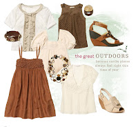
 d I'm addicted to Anthropologie.
Here are a few e-mail and website screenshots (I cropped out the part of the image that says "Shopping cart- 9 items"). *Sigh* My name is Christie an

 d I'm addicted to Anthropologie.
Monday, April 7, 2008
Digital Storytelling
I've been meaning to post about The Painted Bride for a while and with our project 5 flash story looming, I thought now was a good time to do so.
I interned at this place when I was an undergrad and it was one of the most fascinating places I've ever worked. If it hadn't been just an internship, it would have been my dream job. They support both emerging and established avant-garde artists- visual, spoken word, instrumental, dance, theatre, vocal and now, digital storytelling. If you're ever in Philadelphia, stop by. It's truly a unique place
Here's a link to their digital storytelling page.
Project 4 - ideas
I think I'm going to do two rough drafts of two different concepts for this one. I'm walking the line between doing one of the following:
1. 4 neighbors you hope never move to your neighborhood (and what to do if they do)
This one is a funny/obnoxious concept and I think I'll use illustrations for it as opposed to photos.
2. 4 types of jeans every women should own (and how to wear them)
I've done fashion articles before and I love doing them, but I'm not sure if I want to do this for this project. I'd almost rather do one that shows my twisted sense of humor (the first one). Either way, this is another fun project.
get linkedin
I highly recommend this professional networking site. It's myspace for the working professional and it's great whether you're job hunting, reconnecting with old coworkers or just want to have an online resume.
Here's the site url: www.linkedin.com
And here's my linkedin page
Here's the site url: www.linkedin.com
And here's my linkedin page
Wednesday, April 2, 2008
Project 3


Postcard(top two images), ad (middle) and the poster (bottom).
Keywords: advertising, copywriting, graphic design, illustration
Monday, March 31, 2008


Midterm review, classes and construction paper
I couldn't have asked for a better midterm review. Good feedback on all sides. I wasn't expecting a bad review or anything, but there have been times (recently) when I questioned my design or writing choices. Perhaps it stemmed from a recent (awful) work situation. And it's always difficult to see your work the way other people see it, especially when you've been staring at it for 8 consecutive hours. But, like I said, good feedback from both Stephanie and Allison. I like having my work validated by working professionals outside of my immediate job, especially since they get to see my non-corporate, free-thinking design as opposed to the corporate box I normally work in.
I decided against taking 9 credits in the fall. Why put myself through the torture? Instead, I'm taking Hypermedia this summer and then Media Design and Editorial Style in the fall. I'm pretty excited about Media Design since it seems like it will be a little like digital storytelling, which I find fascinating.
I'm anxiously awaiting the scanned files for our little 2D design project from class on Saturday. I quite liked our "Careful what you fish for" story, but we definitely needed some gray construction paper. Our shark, despite our best efforts, still looked a little like Shamu with teeth.
Thursday, March 27, 2008
Speaking of collage

Rebecca's post with her collage made me think of this book I've been dying to buy. It's all about incorporating handmade objects and art into graphic design. I'm buying myself a nice, expensive scanner so I can do start doing this.
Monday, March 24, 2008

Wednesday, March 12, 2008
Why project 3 is making me crazy (otherwise titled, I need a Mac)
This poster is a nightmare. The file is freaking huge (over 800,000 kb) and kept crashing my (pc) computer today. I was planning on taking the files to the printer during lunch today, but since I couldn't save the files, no trip to the printer for me. As I write this blog, the poster is attempting to save. It takes about a fifteen minutes to save the damn file. Now, I'm a day behind and I'll have to cram everything else in tomorrow since I've spent the evening fighting with this stupid file.
ETA: I finally saved the stupid file, but now my disk keeps freezing up when I'm trying to burn the files to it. How the hell am I supposed to get this thing to the printer if I can't even burn it to a disk? What a freaking PITA. It's not even that big (physically) - 18"x24" shouldn't create massive issues, but I have a lot of layers, so that's the problem. I'm having a difficult time trying to make it better because every change requires another 15 minute save. I officially hate this poster. And I think the feeling is mutual.

On a brighter note, since Stacey requested a picture, here's Lucy. Isn't she adorable?
Stella also wanted to say "hi."
ETA: I finally saved the stupid file, but now my disk keeps freezing up when I'm trying to burn the files to it. How the hell am I supposed to get this thing to the printer if I can't even burn it to a disk? What a freaking PITA. It's not even that big (physically) - 18"x24" shouldn't create massive issues, but I have a lot of layers, so that's the problem. I'm having a difficult time trying to make it better because every change requires another 15 minute save. I officially hate this poster. And I think the feeling is mutual.

On a brighter note, since Stacey requested a picture, here's Lucy. Isn't she adorable?

Stella also wanted to say "hi."
Monday, March 10, 2008
I need air
I'm trying not to get overwhelmed by the amount of work I have to do this week. This campaign project, while fun, is extremely time-consuming. Fortunately, my profile is pretty much done. Stephanie liked the writing and it only needs a few tweaks; same for the design. So, I can throw all my energy into the campaign. I suppose I should work on some of my freelance projects, too.
I stayed home from work today because, 1) We got a new dog over the weekend and she's having some issues adjusting to our other dog, 2) I didn't get a very good night sleep last night and feel like crap, and 3) I need to work on this project. The two animals have me sandwiched between them on the couch, which is making it slightly difficult to work, but they seem to be happy that someone is home with them today.
Time to get back to work. I need to finish this poster ASAP, so I can deal with any printing nightmares that are bound to occur. I figure if I start on Wednesday with the printing process, I'll have three days to get it under control. And, I'm really glad I didn't choose the arts in education as my cause since two other classmates chose that. Even though, it is my biggest soapbox, I think it was a wise choice to go in a different direction for this project.
Friday, March 7, 2008
Project 1 - Final images
These are my final files from Project 1 - compare/confuse...errr, contrast.


Wednesday, March 5, 2008
Project 3 ideas
I've narrowed my soapboxes down to a few front runners and I think my favorite one for this project is voting, especially with the impending elections and the close primary race between Obama and Clinton (go Hillary!!!). I still think I'll bring rough drafts of at least one other topic (the arts, buying local/downtown revitalization or elderly care) and see how it all pans out. But I really like my voting idea and I've got a lot of good ideas for visuals for it as well.
ETA: I've actually decided to do a few different concepts for voting. I really love this idea and my mind is brimming with creative ways to execute it.
ETA: I've actually decided to do a few different concepts for voting. I really love this idea and my mind is brimming with creative ways to execute it.
Sunday, March 2, 2008
Project 3- Cause & Effect / Show & Tell
Thoughts on project 3
I'm ecstatic about this next project. I already maintain a few social awareness soapboxes, so my only issue with this project will be narrowing down the selection field to the most viable issue. I also love the campaign element of this project. Campaigns are one of my pet projects. I am not, however, looking forward to the impending logistical nightmare when I attempt to print, cut, mat and transport the ginormous poster. No 11th hour Friday changes for this project.
Show & Tell
When we first got this assignment, I immediately thought of an "America's Next Top Model" episode from last season when the models did a photoshoot/campaign for the effects of smoking. The final photos showed the cause and the effect all in one image. I loved it. Much more than I love "America's Next Top Model." I'm not even sure why I was watching it that day, but at least I got a good show & tell out of it.
Two images from the photoshoot:


Friday, February 29, 2008
In the trenches - a brief rant
In my quest to eradicate "to be" from all of my professional writing, a few obstacles emerged. Many people feel such deep attachment to using this verb that they suggest it for headline usage (and then ask why I disapprove so much- true story, happened today.) But really, do you want to read that "widget A is here" or do you want to read that a "widget A increases efficiency"? I'll go with the latter. Who cares if it's here? Unless it's Jesus Christ himself, I don't care what (or who) is here, but I do want to know what it does and how my life, job, dog, general disposition will improve if I buy it. After all, isn't the point of all advertising to get someone, somewhere to buy your product or service? Simply telling me that it's here doesn't make me care enough to find out why I should care.
So, the next time someone asks why I disapprove so much of using "is" (especially in a headline), I'll use my classmate, LaDonna's, example of comparing it to Arial. Or maybe, to use another design analogy, I'll compare it to using a Photoshop filter. Just because it's there, doesn't mean you should use it. With so many other colorful verbs (or interesting fonts or alternatives to filters) out there, why choose the easy, common one?
So, the next time someone asks why I disapprove so much of using "is" (especially in a headline), I'll use my classmate, LaDonna's, example of comparing it to Arial. Or maybe, to use another design analogy, I'll compare it to using a Photoshop filter. Just because it's there, doesn't mean you should use it. With so many other colorful verbs (or interesting fonts or alternatives to filters) out there, why choose the easy, common one?
Monday, February 25, 2008
To be or not to be
Definitely not to be...
I'm taking back the verb. After the discussion in class on Saturday, I reviewed my writing for "to be" offenses. I found it in a few cases. Despite my efforts not to use it, it still occurs in my writing, usually the result of laziness, rather than a conscious choice.
Lately, I've become weary at work because I constantly edit "to be"-riddled writing. It's a highly contagious epidemic. It seeps into my brain without my consent and wraps its lazy tentacles around my thoughts, draining the life from my writing and replacing it with a colorless verb wasteland.
But already today, through my efforts to fight the laziness, my writing shows bursts of color and interest. I almost forgot the feeling of painting a written picture, but three weeks into grad school, it seems, it's back.
Six word memoir
Here's the first one I thought of:
Displaced urbanite surviving suburban utopia nightmare.
Displaced urbanite surviving suburban utopia nightmare.
Project 1- the revision / Class 3
Musings of Project 1
I think I overthought this project. More specifically, I think I approached this project as a marketing communications professional rather than a writer/designer/grad student (emphasis on the grad student.) As a result, my copy and design were more ad-like and less compare/contrast English paper-like. Obviously, this isn't supposed to read just like an English essay, but I think I took it too far over the ad edge and made it too conceptual, which resulted in less compare/contrast than Stephanie was looking for (in actual words, anyway.)
This is not a problem. I have a new (and more simple) concept that will accomplish the compare/contrast in the original assignment. I've worked on a new design that I actually think I like better and will work much better with a compare/contrast body copy. And it will still function well as a sign for fruit in a market.
Class 3 reflections
The first critique proved interesting, at least. I did learn a lot and noticed some things about my own project from the critiques of others projects and it helped reel me in from the ad agency world and back to reality. What I did find more helpful this time was the small groups- people seemed to have a better grasp of what to expect, probably largely because it was the second time around. But, I also think the profile assignment was more straightforward than the last one. At least I wasn't the only one who thought too much about compare/contrast.
Wednesday, February 13, 2008
Project 2- The idea
Project 2 is a little redundant for me since my undergrad degree is in magazine journalism and I've done several profiles and magazine layouts for that. However, I still think that there is an opportunity in this project to stretch my skills.
The magazine I'm using is Pink, which is a magazine targeted toward women in business. I'm interviewing my boss this afternoon. She is the Communications Manager here and I'm sure she has an interesting story to tell. (Even though her initial response when I asked her if I could interview her was, "I'm not that interesting!") Everyone has a story. It's my job to get hers.
The magazine I'm using is Pink, which is a magazine targeted toward women in business. I'm interviewing my boss this afternoon. She is the Communications Manager here and I'm sure she has an interesting story to tell. (Even though her initial response when I asked her if I could interview her was, "I'm not that interesting!") Everyone has a story. It's my job to get hers.
Tweaking the concept - project 1
I'm definitely happy with my original idea, but I think, in order to strengthen the compare/contrast element, I need to add something. It was an idea that I tossed around originally, but decided not to incorporate it in my rough draft. I'm putting it back in the comp. The overall theme is Cinco de Mayo with a focus on salsa with the fruits and traditional vs. tropical. The rest of the ideas are staying the same. Body copy will be tweaked slightly, as it should be when it goes from a rough draft to a comp.
For the design, I've decided to use both Photoshop and Illustrator. This is typical of most of my design projects. I set up a file for each one in Illustrator, Photoshop and InDesign. Any drawings that I want, I draw with Illustrator, then I import them (and any other images) into Photoshop and alter/design the final image(s) there. Then I drop that image into InDesign (if the piece is text-heavy) and finish the text there. This project will work the same way and I think by adding a small amount of illustrations, it will add interest to the design. I'm also going to add an additional image into the background for each sign.
I'm pretty excited about this project because I'm using (and expanding) a wide-range of skills for it - writing, design (all of CS3) and advertising. This is exactly the kind of thing I was hoping for in this grad school program.
Friday, February 8, 2008
A solid concept...I hope
Now that my rough draft (emphasis on the rough) is completed, I thought that it would be a good idea to put my idea into my blog. I hope I've gotten this concept right. Here's a summary explaining the assignment and my interpretation/execution of it:
We had to create two signs for a food market (I chose Broad Street Market in Harrisburg.) Each sign had to sell one kind of fruit. Of the two fruits, one had to be exotic (I chose mango), the other had to be ordinary/common (I chose tomato.) We had to compare and contrast the fruits (to each other) in our signs. One sign had to compare, the other had to contrast (that was the difficult/out-of-the-box part.)
The theme I chose was salsa- mangos for tropical fruit salsa (sweet!) and tomatoes for traditional salsa (spicy!) and went from there. I'm comparing mangos because tomatoes are the typical ingredient in salsa, but hey! - Mangos make good salsa, too! I'm contrasting tomatoes because while mangos are the most eaten fresh fruit all over the world, tomatoes are the most consumed fruit (because of all of the recipes they are found in.) And of course, this all has to fit on a 5x7 sign with tightly written ad copy. I'm including a few interesting facts about each fruit, along with (of course) a salsa recipe for each fruit on its respective sign. The recipe will be on a tear-off card that is mounted to the sign (I'm hoping that this is okay.)
As I mentioned in a previous post, I'm focusing heavily on typography. I've decided to go with a very clean look, using fruit glamour shots that I took myself. Overall, I'm happy with the initial design, but it's still very rough and I know I'll have a lot of tweaks for the comp/final phases. But I definitely think that I have a good start to this project.
Thursday, February 7, 2008
Compare/Contrast
During the last week, I have been completely consumed by my fruit project. There are so many factors to consider with this assignment.It's ad for a market or store, therefore it must have a brand identity. The ads should look the same, as they are part of a campaign. I've also decided to focus strongly on typography in the headline and to have the images in the ads mirror each other. This should create a visual compare/contrast between the two signs beyond just the compare/contrast of the copy.
Speaking of compare/contrast, I've decided on my fruits and I've found that it's very hard to only compare or contrast. Both of these occur by default with the presence of the other; sometimes they are only inferred, but they are still present.
I'm finished with my research and need to compose the rough draft of my copy tonight. I already have a few sketches for the art, but I need to finalize that as well. At the moment, I'm trying to decide how I want to represent the fruit, whether I want a very realistic photo or a more graphic, illustrated interpretation. The final decision for that will probably not be made until phase 2.
Sunday, February 3, 2008
Feeding the addiction
I was thoroughly amused that as part of the class structure, we will be looking to magazines for inspiration. Not because I don't see them as a good source. Quite the opposite, actually. As a magazine junkie, I felt validated by the instructions to collect magazines. Finally, an actual reason to buy more magazines!
Collecting magazines is nothing new to me. I've been reading them since I was a kid- first Highlights and Zillions ('Consumer Reports for kids'), then on to adolescence and Seventeen, YM and 'Teen. I hoarded those teen magazines for years. When my family moved, my mom made me throw away my prized collection. I'm still mourning the loss. And she still thinks I'm nuts.
Now, as an adult, I subscribe to an embarrassing amount of magazines (nevermind the supermarket impulse buys- me? Read USWeekly? Pssssht.) The mailman probably wonders why someone who lives in Harrisburg is reading Portland Monthly (yes, Portland, as in Oregon.) Incidently, I started subscribing to that magazine, not for its content, but for the design. I found it fresh and contemporary and inspiring.
My live-in boyfriend, who has large amounts of disdain for the ever-growing pile of magazines lurking in the corner, was less than thrilled with my declaration that he could not throw any (no, not one) of those precious glossies out. I need those magazines for class, I told him triumphantly. I will be using them extensively for research. Hands off!
So, for this semester, I am free to gleefully buy as many magazines as I wish. And I am validated in my addiction. Until May, anyway. Then, the boyfriend will seize the magazines and have a Memorial Day bonfire. A really, really big bonfire.
Fruitastic
I like assignments about food. It gives me an excuse to eat. And I love to eat. So far today, I have consumed two pears, a mojito mango smoothie, a tomato and mozzarella panini and chips with tropical fruit salsa. All in the name of research and inspiration. I'm feeling a little full and I think I'm on a bit of a sugar high, but I've definitely come up with some viable ideas for the project.
Subscribe to:
Comments (Atom)